Simple Inventory GUI
Introduction
For the final tutorial in the series, we will make a simple inventory GUI. We will look at how to setup the graphics for your background and buttons. A small script will be written to change the contents of the list for each of the buttons pressed and set up the title text.
Suggested Reading:
- GUI Editor Overview
- GUI Interface
- TorqueScript Reference
- GUI Tutorial 1 (Creating a New GUI)
- GUI Tutorial 2 (Adding Controls)
- GUI Tutorial 3 (Mini Console Tutorial)
- GUI Tutorial 4 (Simple HUD)
- GUI Tutorial 5 (Advanced Dialogs)
Covered in this tutorial:
- Learn how to implement a background image
- Make an image into a button.
- Lists in use
Setting Up
To complete this tutorial you will need some image files. You can either create your own or use the images from this tutorial:
Get the Tutorial 6 Images here: ( gui/tutorials/Tutorial6_images.zip)
If you have downloaded the Tutorial6_images.zip please place the new folder “images” into game/art/. Open your tutorial project and start the GUI Editor. Create a new GUI and call it InventoryGui of GUI class type GuiControl.
Bitmap Controls
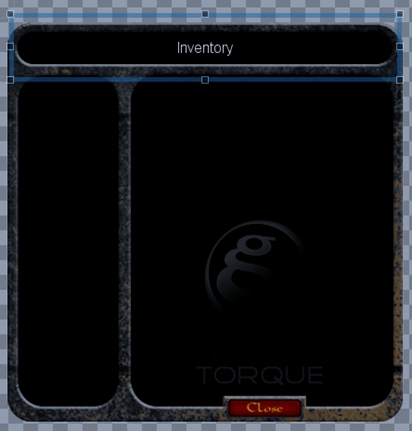
STEP 1: From the Library > Images category and add a GuiBitmapCtrl to the editor work space. Drag the new control into the center of your editor. From with in the GuiBitmapCtrl section of the properties panel you will notice the square box to the right of the bitmap property.
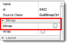
When clicked, this box will open a file browser. Locate your game/art/images folder and load the file backgnd.png.
GuiBitmapCtrl Property bitmap: art/images/backgnd.png
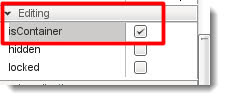
While we are also in the property section, we will need to set this control as a container. By being a container this control can become a parent control for the buttons and text controls of our inventor gui:
STEP 2: You will need to resize the bitmap control by dragging on the sizing handles, do so until you have something looking similar to this:
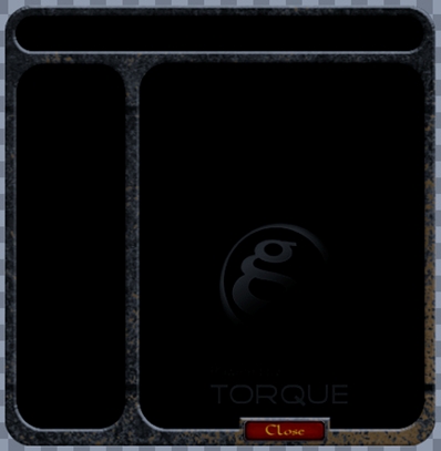
NOTE: The Close button is embedded into the background image.
Now would be a good time to make a save if you have not done so already. Save the GUI as inventoryGui.gui.
STEP 3: Making sure you have the GuiBitmapCtrl selected, add a GuiTextCtrl from the Library > Text category to act as our inventory title. Place this in the space at the top of our inventory, stretch it, and set its properties to the following:
GuiTextCtrl property name: lblInvTitle
GuiTextCtrl property text: Inventory
You will notice that the text is very hard to read. We are going to adjust its color with a control profile. Instead of choosing one from the many provided, this time we are going to make our own.
GUI Profile
Setting up your own profile is very easy. Head to the folder game/art/gui and open the file defaultGameProfiles.cs in Torsion or another text editor.
If defaultGameProfiles.cs does not exist in your project you can add the following code to the end of art/gui/gameProfiles.cs and then at the top of scripts/client.cs add the line:
exec("~/art/gui/gameProfiles.cs");
To make our Inventory look good we are going to create three new profiles. In the defaultGameProfiles.cs add the following script at the bottom of the file:
singleton GuiControlProfile (InvList)
{
        opaque = true;
        fontType       = "Arial";
        fontSize       = 16;
        fillColor = "150 150 158"; //selection color
        fontColor = "255 255 255";
        justify = "left";
};

singleton GuiControlProfile (InvScroll)
{
        // make transparent
        opaque = false;
};

singleton GuiControlProfile (InvGui)
{
        // make transparent
        opaque = false;

        //Font
        fontType       = "Arial";
        fontSize       = 18;

        //Set font color - R G B (range 0 -255 )
        fontColor      = "200 200 200";
        justify        = "center";

        //Draw a border
        border         = 1;
        border         = false;
};
You will notice the new profile names that will be displayed in the GUI controls profile property:
singleton GuiControlProfile( profile name ){ ... }
Hint: When naming variables, controls, profiles, etc., try to be descriptive of its purpose. You can only use the label once otherwise you will have errors due to conflicting naming. For example, calling our profile inventoryGui would have caused a conflict with the name of the GUI itself.
To give you an idea of which properties are available, here is a table with explanations:
Note: certain GuiControl classes use this bitmap [[#Parsing_the_Bitmap|parsed into multiple pieces. |
More Visual Editing
Open your project up again and load the inventoryGui.gui file. Select the title control GuiTextCtrl set its profile property:
GuiTextCtrl Property profile: InvGui
The GuiTextCtrl now uses the profile we created in script. By changing the profile the title text can now be seen. Before we create our bitmap buttons we need to add scroll and list controls to display our items.
With the GuiBitmapCtrl selected, add a GuiScrollCtrl control to the large pane. With the GuiScrollCtrl selected, add a GuiListBoxCtrl. The control list should look like this:
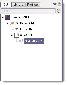
Hint: GuiScrollCtrl can be found in the Library > Containers category, GuiListBoxCtrl can be found in the Library > Lists category.
Next we need to change a few properties to get it all looking nice:
GuiScrollCtrl property profile: InvScroll
GuiListBoxCtrl property name: lstInventory
GuiListBoxCtrl property profile: InvList
GuiListBoxCtrl property fitParentWidth: checked
Now is a good time to save.
Bitmap Buttons
Before we add functionality via script we need to add one last set of controls: our bitmap buttons.
STEP 1: With the GuiBitmapCtrl control selected add a new GuiBitmapButtonCtrl and place it in the left hand panel of our GUI.
Hint: GuiBitmapButtonCtrl can be found in the Library > Buttons category.
Set the new controls property: (remember you can click the file box to access the browser)
GuiBitpmapButtonCtrl property Bitmap: game/art/images/aRaLogoIcon.png
Resize the control as in the image below:
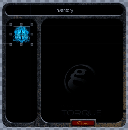
Press F10 to preview your GUI and try the button.
STEP 2: The button does not work! This is because we have specified that the control has a single image for all of its states, thus no change when it is clicked. To remedy this ensure the property looks like the following:
GuiBitpmapButtonCtrl property Bitmap: game/art/images/aRaLogoIcon ( notice there is no file extension )
Now a little note on the bitmap button control. You may have noticed that the image was entered as game/art/images/aRaLogoIcon with no extension ( *.png ). This is very important and not an error, but part of the button multi image system.
Each image needs to be named in the correct format for the button system to recognize the image as part of a multiple image set. Have a look at the images in the game/art/gui/images folder.
Normal - aRaLogoIcon.png
Hover - aRaLogoIcon_h.png
Down - aRaLogoIcon_d.png
If you want to have multiple images for normal / hover / down, you just add the file path and the file name excluding the file extension ( *.png ). The engine will look for the correct images. Save and preview (F10) your GUI to try out the button.
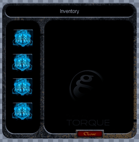
STEP 3: Next, select the new button and copy / paste three more. Arrange the buttons under each other.
HINT: If you select multiple controls you can then resize them all at the same time.
HINT: Remember you can use the icons in the tool bar to line up and distribute the controls evenly.
HINT: The tool bar icons will display a tool hint if you hover the mouse over them.
Set the properties of the new buttons:
Button 1 property name: btn1
Button 2 property name: btn2
Button 3 property name: btn3
Button 4 property name: btn4
STEP 4: The last control we need is the close button at the bottom of the inventory. With the GuiBitmapCtrl selected add one more GuiBitmapButtonCtrl. Set its properties to the following:
Button close property name: btnClose
Button close property Bitmap: game/art/images/inventoryClose (again leave off the file extension)
Resize the control so that it fits neatly over the background image of the close button. Use F10 to preview your GUI to make sure all the button images change with the mouse events.
Adding Functionality
Now that all of the controls are in place, we need to make it all do something. Making sure you have saved your GUI, close down Torque 3D and open your favorite script editor. Create a new script file in scripts/gui/ called InventoryGui.cs.
The new script will add functionality to the buttons which, when pressed, will change the text in the title and place the contents of an array into the list box. Add the following code to your new script file:
//
//global arrays for initial content to be displayed
//
$FOOD = 0;
$SPELLS = 1;
$WEAPON = 2;
$ARMOUR = 3;
$aInv[$FOOD,0] = "Bread x 1";
$aInv[$FOOD,1] = "Apple x 1 ";
$aInv[$FOOD,2] = "Pie x 2";
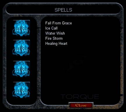
$aInv[$SPELLS,0] = "Fall From Grace";
$aInv[$SPELLS,1] = "Ice Call";
$aInv[$SPELLS,2] = "Water Wish";
$aInv[$SPELLS,3] = "Fire Storm";
$aInv[$SPELLS,4] = "Healing Heart";
$aInv[$WEAPON,0] = "Sword of Truth";
$aInv[$WEAPON,1] = "Chain Axe";
$aInv[$WEAPON,2] = "Dagger";
$aInv[$WEAPON,3] = "Elf Staff";
$aInv[$WEAPON,4] = "Ork Hammer";
$aInv[$ARMOUR,0] = "Light Mail";
$aInv[$ARMOUR,1] = "Light Shield";
$aInv[$ARMOUR,2] = "Cursed Gloves";
$aInv[$ARMOUR,3] = "Invisiblity Cloak";
//
//Give each of our buttons a function to call
//
function inventoryGui::btn1()
{
//set the title text
lblInvTitle.setValue("FOOD");
//clear the list box of previous content
lstInventory.clearItems();
//iterate through our array adding items to our list
for(%i = 0;%i < 4;%i++)
{
lstInventory.addItem( $aInv[ $FOOD,%i ]);
}
}
function inventoryGui::btn2()
{
lblInvTitle.setValue("SPELLS");
lstInventory.clearItems();
for(%i = 0;%i < 5;%i++)
{
lstInventory.addItem( $aInv[ $SPELLS,%i ]);
}
}
function inventoryGui::btn3()
{
lblInvTitle.setValue("WEAPONS");
lstInventory.clearItems();
for(%i = 0;%i < 5;%i++)
{
lstInventory.addItem( $aInv[ $WEAPON,%i ]);
}
}
function inventoryGui::btn4()
{
lblInvTitle.setValue("ARMOUR");
lstInventory.clearItems();
for(%i = 0;%i < 4;%i++)
{
lstInventory.addItem( $aInv[ $ARMOUR,%i ]);
}
}
Next, open the game/scripts/client/init.cs file and add the following under the section // Execute the GUI scripts and functions:
exec("scripts/gui/InventoryGui.cs");
Save your script files now.
Scripting Hooks
We are going to make our final edits in the editor. Run the GUI Editor and load your inventoryGui. Each button now needs to be linked to our new functions. Set the following properties to our buttons:
btn1 property command: inventoryGui.btn1();
btn2 property command: inventoryGui.btn2();
btn3 property command: inventoryGui.btn3();
btn4 property command: inventoryGui.btn4();
btnClose property command: Canvas.popDialog(inventoryGui);
Save your final edits and test out your new inventory system.
Conclusion
In this tutorial, you learned the following concepts:
- Learn how to implement a background image
- Make an image into a button.
- Lists in use
This brings the GUI Editor tutorial series to a close. You should now have enough information to begin constructing your own custom GUIs, specific to your game. You can download the images, GUIs, and scripts created for these tutorials by CLICKING HERE. (gui/tutorials/zip/GUITutorial_Series_One.zip)
Special thanks to Dave Young (aka NightHawk) of aRa Software Tutorials for writing the original guides.
File List
- game/art/
- HelloWorld.gui
- InventoryGui.gui
- miniConsole.gui
- newWindow.gui
- playGui.gui
- testList.gui
- testWindow.gui
- gameProfile.cs
- Torque-3D-logo.png
- game/art/images/
- araLogoIcon.png
- araLogoIcon_d.png
- araLogoIcon_h.png
- backgnd.png
- inventoryClose.png
- inventoryClose_d.png
- inventoryClose_h.png
- game/scripts/client/
- default.bind.cs
- init.cs
- game/scripts/gui
- InventoryGui.cs
- playGui.cs
- testList.cs
- testWindow.cs